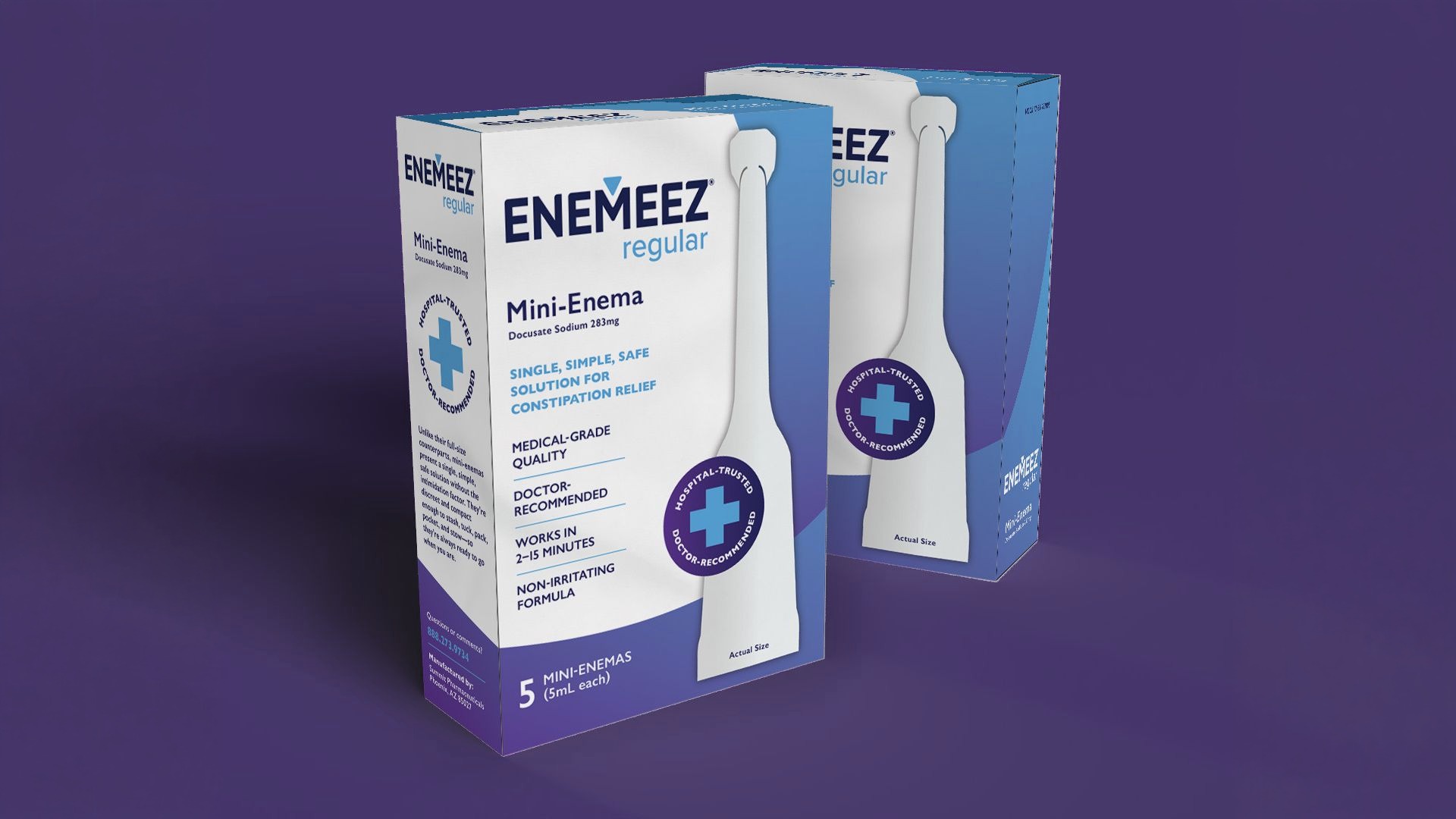
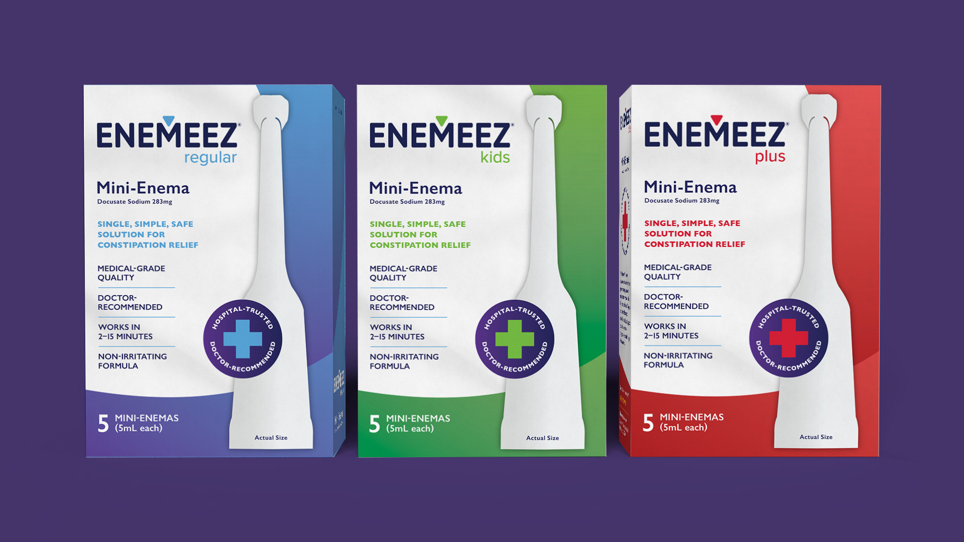
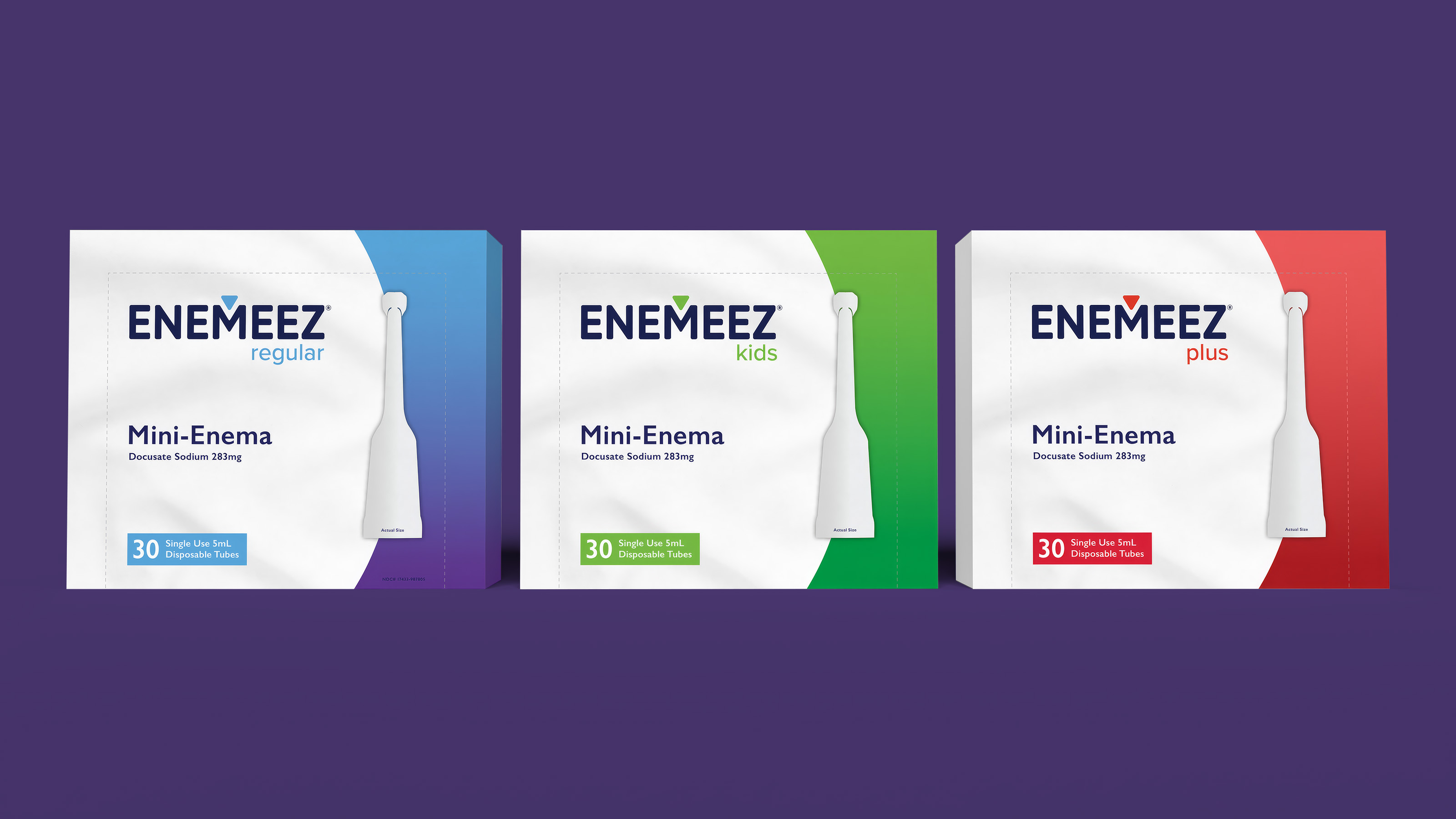
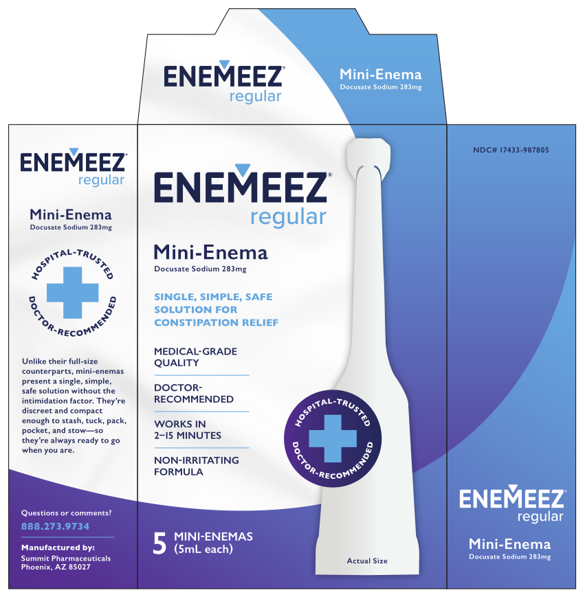
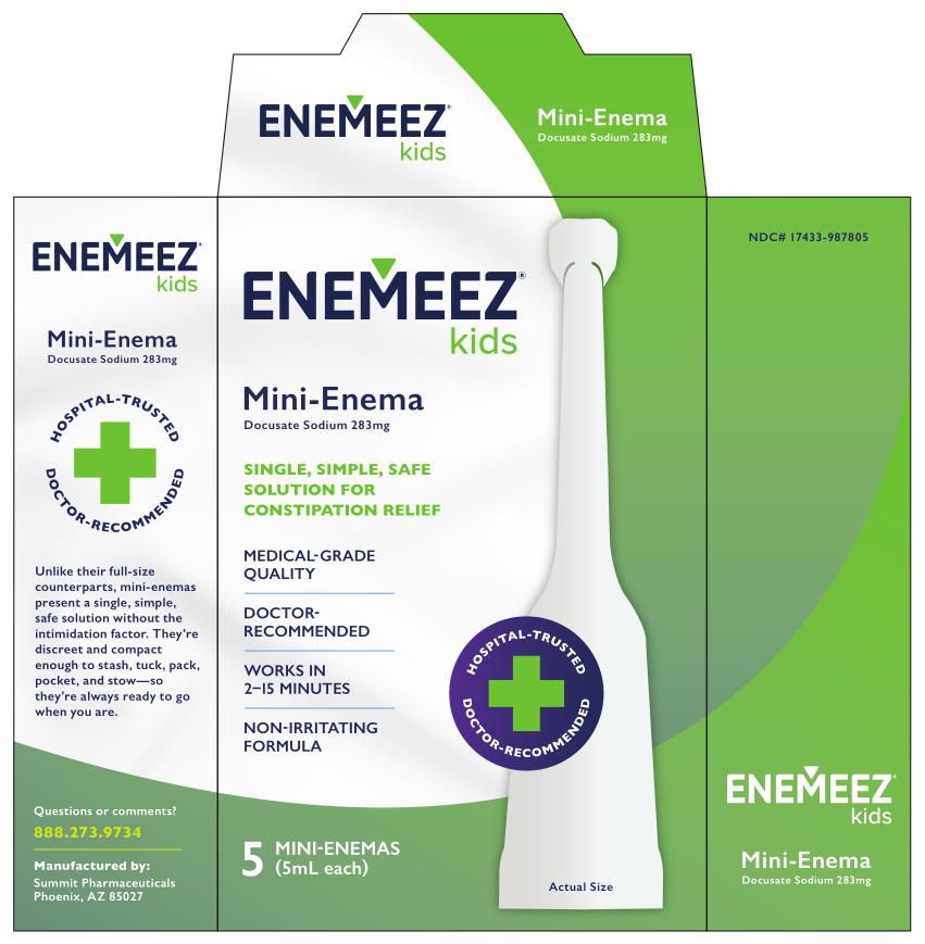
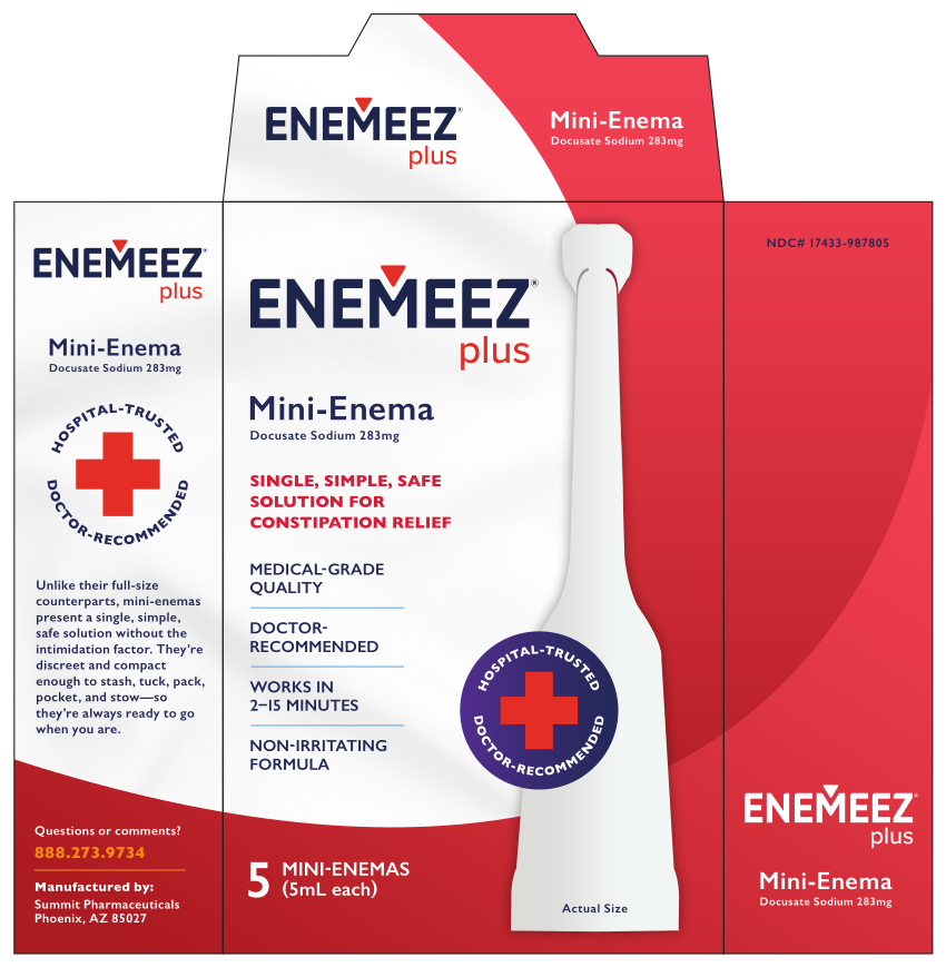
After Quest acquired Enemeez, the brand needed an overhaul to compete with generics taking market share. The logo and packaging were redesigned in tandem. The three-product lines, regular, kids, and plus, had to read as one family while remaining easy to tell apart at a glance. Color already distinguished the three, and the redesign took that further: a refined palette and color blocking create clear separation on the shelf. The solution is a single wordmark carried across every SKU, with the arrow mark – a nod to the product's application – changing color per variant.
- Role
- Sole creative, developing logo concepts and packaging concepts in tandem.
- Outcome
-
Leading
brandEnemeez becomes a flagship for Quest Products, with steady organic growth 500+
storesgrocery locations including Stop & Shop and Giant Food, with more through Albertsons and Publix